
Last week, the Texas Transportation Institute released their annual “Urban Mobility Report,” which surveys congestion and traffic trends across US cities. And the first thing the authors argue in their executive summary is that congestion is a very serious issue indeed:
Congestion is a significant problem in America’s 439 urban areas. And, although readers and policy makers may have been distracted by the economy-based congestion reductions in the last few years, the 2010 data indicate the problem will not go away by itself – action is needed…[T]he problem is very large.
And so on. Clearly, the report’s authors want us all to believe that even if congestion is better than it was a few years back, it’ll rear its ugly head again as soon as the economy picks up again.
But my read of the numbers reveals a somewhat different story: in much of the Pacific Northwest, congestion flattened out long before the recession began.
It’s a story that’s especially clear for Seattle.
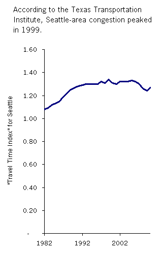 Take a look at the chart, showing the Texas Transportation Institute’s annual congestion metric, the “Travel Time Index” (TTI), for the Seattle metro area. The data track the congestion metric back through 1982—and, it’s clear that after a brief period of rapid growth in the 1980s and early 1990s, growth in Seattle’s TTI score started to flatten out. Congestion inched up a bit in the late 1990s, and hit an all-time high in 1999. Then it slipped back again after the dot-com bubble burst, and fell even more sharply in 2008 when gas prices spiked and the economy faltered. By 2010, Seattle’s Travel Time Index was actually about where it was in 1990.
This may not fit with people’s intuitions; I’m sure that many readers feel in their bones that congestion is far worse now than in 1990.
And perhaps it is. The Travel Time Index is a slippery beast, and in my view it’s not a particularly reliable index of congestion.
The clearest way to see this is by looking at actual commute times. (See Table 4 of the report, on p. 38 of this pdf, in the column of data labeled “Total Peak Period Travel Time.”) Metro Atlanta tops out the list, with 127 total minutes of peak-period travel time per car traveler. By comparison, greater Seattle does pretty well, with only 101 minutes of travel time per peak traveler—about half an hour less per day than in Atlanta.
But if you look at the Travel Time Index, (see table 1, on p. 25) Atlanta beats Seattle handily!! That’s right, Atlanta is ranked as having far and away the longest daily peak-period travel time in the nation. On daily peak-period travel time, Seattle trails way, way behind at #28—pretty good for a city of its size. Yet Seattle ranks as having the 6th highest Travel Time Index in the US, well ahead of #16 Atlanta.
A comparison of Atlanta and Portland puts the Travel Time Index in even worse light. Portland clocks in at just 85 minutes of daily peak-period travel time per peak-period traveler—a third less than Atlanta. And yearly peak-period travel delay totals 37 hours per auto commuter in Portland, significantly better than the 43 hours of annual delay in Atlanta. In short, Portland drivers have significantly shorter commutes and fewer hours of congestion delay per year. Yet despite all of that, Atlanta still has a better Travel Time Index than Portland.
What gives? In a nutshell, the Travel Time Index doesn’t mean what you think it should mean. It’s not a measure of how long it takes you to commute, but a somewhat confusing measure of the percentage by which congestion slows you down as you travel.
What’s worse, the TTI’s underlying math treats driving less as a liability. So creating housing closer to where people work—so that they have shorter commutes—can actually hurt a city’s score on the TTI. Even letting more people opt out of car commutes entirely does little or nothing to improve TTI rankings. Ultimately, the “Travel Time Index” is designed to promote free-flowing traffic, NOT short, convenient commutes.

Yet most of the steps that one can take to promote free-flowing traffic—things to make peak-period car travel faster—ALSO tend to increase how far people drive. It creates a bit of a catch-22 for a city that wants to improve its TTI score: the way to “ease congestion,” as evidenced by an improved TTI, typically involves steps that encourage people to drive more.
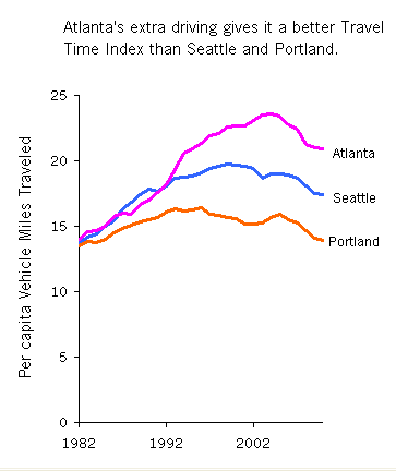
To me, the chart to the right, derived from data in the Texas Transportation Institute report, says a lot: Atlanta drivers log more miles each day than in Seattle and Portland. As mentioned above, they also spend more time in their cars each day. Yet of the three cities, Atlanta has the lowest “Travel Time Index.” It defies logic and common sense. But it’s a story that the Institute tells with a straight face, year after year.
Getting back to the Seattle congestion chart above—given the absurdities in the TTI’s measure of congestion, I’m not sure that it means all that much that Seattle’s Travel Time Index flat-lined in the late 1990s. What’s really important isn’t how long we’re delayed by congestion, but rather, how much of our time and treasure we spend on transportation overall. But those are questions that the TTI—in its quest to promote free-flowing traffic above all else—isn’t well-equipped to answer.


Matt the Engineer
It’s almost as if the TTI was purely created for use by the highway building industry lobbies…
Brenda Bell
Another issue is how long the peak-travel period is for the locality. Does everyone spend one hour for a 15-mile trip between 7AM and 9AM, and one hour for the reverse trip, between 5PM and 7PM, or does it take everyone who has to travel that 15 miles inbound one hour, regardless of whether he leaves at 5AM or at 11AM?