
If you’re reading this blog then the phrase “interesting demographic data” probably doesn’t sound like an oxymoron to you. That’s a good thing because you’ll find a heap of it in a new analytical report out on bicycling. Among other things, we get a clearer view of the race and income components of US bicycling.
Here’s a look at bike trips broken out by racial and ethnic categories:
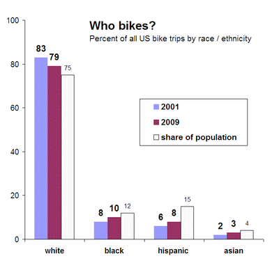

Two big things stand out here for me: 1) white people remain somewhat over-represented; but 2) bicycling appears to be trending toward racial parity. As of 2009, roughly 21 percent of all bike trips in the US were made by people of color, and it looks as though US cyclists may soon look pretty darn similar to the nation as a whole.
Now, here’s a look at bike trips broken out by income categories.
If you divide up Americans by income into four equally-sized categories (“quartiles” in the business”), this is how they represent among bike trips:
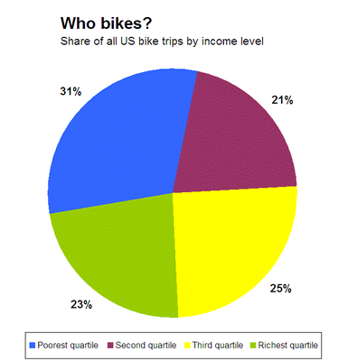

Surprised? Contrary to popular convention, the biggest share of bicyclists isn’t yuppies, it’s low income people. In fact, the lowest-earning quarter of Americans make nearly one-third of all bike trips. Among that group, I would expect to find at least some fraction of working poor, students, the unemployed, and retired people of modest means. No doubt there are almost as many reasons to bike as there are cyclists, but it’s clear that bikes are a favored choice among those on a budget.
The big takeaway for me, however, is looking beyond low-income riders. Bicycling is remarkably evenly distributed among the remaining three quartiles. With the exception of the over- represented bottom quartile, bike trips don’t appear to be the province of any one income class more than any other.
***
Wonky update, 4/6/11—Commenter RK, below, asserts that in the first chart I’ve used Census demographic data that are inconsistent with those used in the study’s treatment of bicycle trip demographics. The study itself does not make clear which demographic data set are being used, and after reviewing the primary source materials used by the study, I’m still not clear which are appropriate.
Nevertheless, in an effort to provide a fuller perspective on the demographics, I’ve created a new version of the first chart that uses the Census data RK believes are accurate. In this case, “hispanic” is treated as a racial category that is mutually exclusive of other categories, rather than as an ethnic characteristic that crosses racial categories. The result is that the share of “white” is reduced, like so:
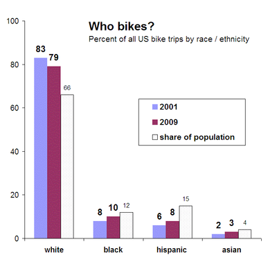

Slicing the numbers this way, we see a more pronounced over-representation of white bike trips. Other racial categories remain unchanged, as does the trend toward racial parity in bike trips.
***
Notes: I created these charts using the data from Table 3 on page 5 of “Analysis of Bicycling Trends and Policies in Large North American Cities,” published by the University Transportation Research Center, authored by John Pucher at Rutgers and Ralph Bueler at Virginia Tech. In the first chart, “share of population” figures are provided by me and are the percentage reported by the American Community Survey’s 2005-2009 averages, and do not include multiracial figures. The second chart, “bike trips by income” refers to 2009.
N/B – I corrected a small error in the first chart that I discovered after it was re-posted by Andrew Sullivan. The correct share of white people is 75, not 76.


eldan
Considering all the “lala they’re all bunch of a white yuppies” rhetoric that comes out any time an argument about cyclists gets stupid, it’s striking just how normal the demographic is, and how evenly distributed cyclists are through the population as a whole.
james
The white columns add up to 107%. Maybe I’m misunderstanding what that column is meant to represent?
Eric de Place
Yeah, that’s confusing. Here’ the explanation…”Hispanic,” according to Census methodolgy, is an ethnicity that can cross racial categories. So it would be a problem if white + black + asian added up to more than 100%. But “hispanic” is an ethnic characterization that could be applied to members of any of those racial classes. Make sense?
RK
Eric,Your racial analysis is flawed and the white percentage of the general population needs to be reduced on the graph. The biking data is based on what is known as the “combined race/ethnic format” in which the Hispanic category is treated as a separate race. The Census data includes much of the Hispanic population as also being racially “white”. If you want to make an apples to apples comparison, the “white” percentage in the Census data should be equal to everyone who is not black, hispanic, asian, or American Indian. In this case, that would be 69% minus whatever the American Indian percentage is (you don’t have it here). This is what is done in employment discrimination cases, for instance, when Census data has to be compared against private employer data in which Hispanic is treated as a race.
Eric de Place
RK,Thanks for contributing. I’ve added an ammendment to the post that I hope addresses your concerns. Please see above.
John
The over-representation of cyclists in the first income quartile and the under-representation in the second quartile demonstrate the stigma that is still attached to cycling. In the minds of the lower middle class, only losers ride bikes, and having a car means you’re not a loser. I wonder if the under-representation amongst blacks and hispanics is an artifact of a larger proportion of blacks and hispanics being in the second income quartile.
rjm_sino
Now, my question is, where are the dedicated bike lanes and easiest streets/routes to traverse as a bicyclist? If there is income parity in the volume of bike riders, is there also parity in the locale and accessibility of safe bike routes???
Richard Masoner
I wonder how much the Hispanic category might be undercounted? The local Census workers where I live in California have a devil of a time getting even legal residents to fill out Census forms in spite of extensive outreach.
Richard Masoner
Question: Do you have any idea if the income levels are personal income or household income?For personal income, the lowest 25% is income under about $15K/year. The top 25% is anybody who makes more than about $50K/year.
Eric de Place
Richard,It’s household income. In 2009, US median household income was around $50k.
lorrax
Having lived for a short period of time in the Netherlands, where nearly everyone rides a bike, the US cannot compare in terms of bike ridership. In short, bike riding in the Netherlands is cheap, safe and due to an almost complete absence of elevation change, really easy. Personally, I rode my bike everywhere. I live in a walkable community now, but only ride my bike occaisionally. For example, I live 6 miles from my place of employment, not an unreasonable distance by bike. However, there is almost 500 feet of elevation between my residence and my workplace, and yes, it would be partially uphill both ways. Unless I move to a flatter area of the country, I will be leaving the bicycling to work to the lycra set. No amount of bike lanes or on-site showers is going to change that.
Erin Greeson
Thank you for this poignant data. I’ve been a bike commuter ever since I moved to Portland (Ore.) nine years ago, and the benefits – health, enjoyment, savings, less dependence on foreign fuel – have literally changed my life. I became deeply involved in grassroots efforts to achieve safer shared streets for drivers, cyclists and pedestrians, and Portland has come a long way. Our bike commuting stats skyrocket each year, and it would be great see more citizens partaking in the benefits. Cities like New Orleans are great places to bike, and the more people on bikes, the more people can save money, achieve good health, and avoid the hassles of parking and traffic delays. Thanks again for raising awareness about this data. I hope to see it balance out in coming years.
Ross Williams
I think using demographic data to refute impressions people have is dangerous. I hear “young” as part of the cyclist stereotype as often as class and race. And that “low income household” category no doubt includes many well-educated young people who are not yet making a lot of money. But the folks making the criticisms based on reace and class would, rightly I think, consider many of them upper middle class.
Tiago DeJerk
Considering that there are much more low-income than rich people in the US, it seems to me that this “distribution” of ridership is unequal. What is the percentage of those populations that ride bikes? Same question goes to representation by race, as in what is the ratio of white population / white bike riding population, black population / black bike riding population, etc
Ishani Mehta
@Tiago DeJerk As regards your question about representation by race, I think the chart (refer to the corrected chart that takes into account RK’s comments) could be used to derive some of the information you asked for. My methodology may be incorrect, but I thought it was worth a shot…read onSay the total population is 100. Of that 66 are white, 12 black, 15 hispanic, 4 asian and 3 are others (assumption to get to 100). Now 79 per cent of all bike trips are by the white. Assuming one bike trip per person, we can say that 79 per cent of bikers are white; and similarly,10 per cent black, 8 per cent hispanic and 3 per cent asian. Now if the total number of bikers (which as per our simplifying assumption means the total number of bike trips)is x, then the percentage of bikers to non-bikers is x. Then, the ratio (in percentage form)of white bike riding population to total white population could be calculated as 79x/66, and similarly for black (1x/12), hispanic (8x/15) and Asian (3x/4). While it is not possible to get actual values of the ratio without knowing the actual value of number of bike trips (which as per the simplifying assumption would equal the number of bikers), comparions can be made between the ratios by simply assuming a reasonable value for x (which is also the percent of bikers to total popluation as per our assumptions). Say x is 30 (a reasonable assumption).Then the ratios come out as follows (in percentage):Total bike riders to total population: 30White bike riders to white population: 40Black bike riders to black population: 25Hispanic riders to hispanic population: 16Asian riders to Asian population: 22.5This is good to see relative differences :)Caution: There are quite a few simplifying assumptions which though reasonable could have led to oversimplification. Having actual data would be better. This is useful if we don’t have actual data of the number of bike riders etc.
John Laidlaw
Lorrax makes an excellent point – one borne out by my own experience.Another one is the low density of population – for much of the country, distances from home to work, or shops, is far too great for easy riding, as he reports from the Netherlands. Add to this our continental climate – hotter ‘n the hinges of Hades in summer, and quite the reverse in winter – and a society built on cheap fuel, and free roads. Yeah – for many of us, cycling is going to be marginal, even to the extent of our thinking ourselves “dedicated, serious riders” when we make a point of driving 25 or 30 miles to get to a place to ride off-road, as we don’t think it safe to use the roads.
Jeff Potter
The number of whites biking dropped 4% in the 8 yrs from ’01 to ’09? It seems to me that there’s instead been a boom in all kinds of cycling, in all groups. In my scan of the OP and remarks I didn’t notice comment on this one surprising (to me) area of decline. Any guesses as to what’s up? Am I missing something obvious?
Eric de Place
Jeff,It’s not an absolute decline, it’s a decline in the share of all bike trips. Biking is, as you observe, on the rise among all racial groups.
Edward Brown
I really enjoy riding my bike. I also enjoy going for a bike ride. These are similar statements but at the same time two very different things. I am a business owner, young at heart, and enjoy staying active. The thing is that I am so busy, I am rarely able to find the time to enjoy a bike ride. It is quite impossible for me to ride my bike to work because being involed in Auto Sales Vermont requires the use of my vehicle. My point being that maybe as an individual increases in age, obtains certain employment responsibilities, and/or their finances increase it may be more difficult for them in many cases to be able to enjoy having the option of biking. For myself being younger and having less responsibility seemed to provide me the opportunity to bike more often. However, I will always truly enjoy each opportunity that I have to ride my bike.
Michael, Portland Afoot
A quibble with the charts above: the racial/ethnic makeup of the U.S. population has also shifted between 2001 and 2009. I assume the “share of population” figures are from 2009. When comparing changes over time, this shift in population shares would tend to soften the improved equity you describe.
That said, I’ll guess from these numbers that equity still improved over the 2001-09 period.