
To mark the international climate negotiations in Copenhagen, I’m trotting out some maps I made a while back. This one has states labelled with the names of countries that are their greenhouse gas equivalents.
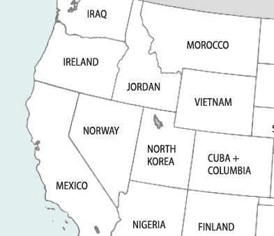

In other words, Oregon is responsible for the same level of climate emissions as Ireland; Wyoming is the greenhouse gas equivalent of Vietnam, and so on.
Want to see the whole thing? Bigger versions are here.
And here’s another slice at the same data. On the version below, regions are labelled with the names of their climate emissions equivalents.
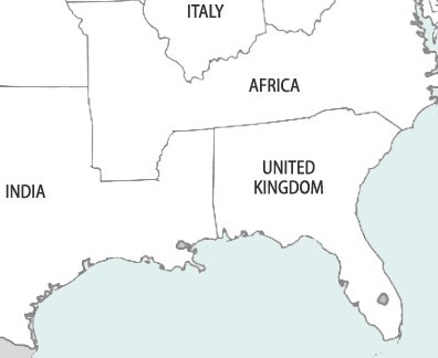

The coal belt through Appalachian country emits as much as the entire continent of Africa. The oil-heavy Gulf Coast states emit as much as all of India.
I’ve done emissions equivalency maps for Canada too: one comparing provinces to US states and one comparing provinces to nations.
UPDATE: Please take a look at these tables to compare per capita emissions. In brief, the maps compare the 291 million Americans circa 2005 with more than 1.5 billion people (in the first map) and more than 3 billion (in the second map). Specific population numbers for each state and country are here.


Richard
The maps would be more helpful if you had put population numbers with each of the countries as well as the populations of the states. Per capita emissions are more sobering.
Eric de Place
Richard,Good point. I’ve added an update to the blog post.(Per capita figures are available in a link from the map pages, but that’s maybe a bit too indirect).